Friends’ Central School
Branding a school dedicated to shared values
Founded in Quaker Values, Friends’ Central School is driven by a simple idea: We Go Further. This mantra embodies the school’s commitment to academic excellence and their dedication to awakening courage within each one of their students.
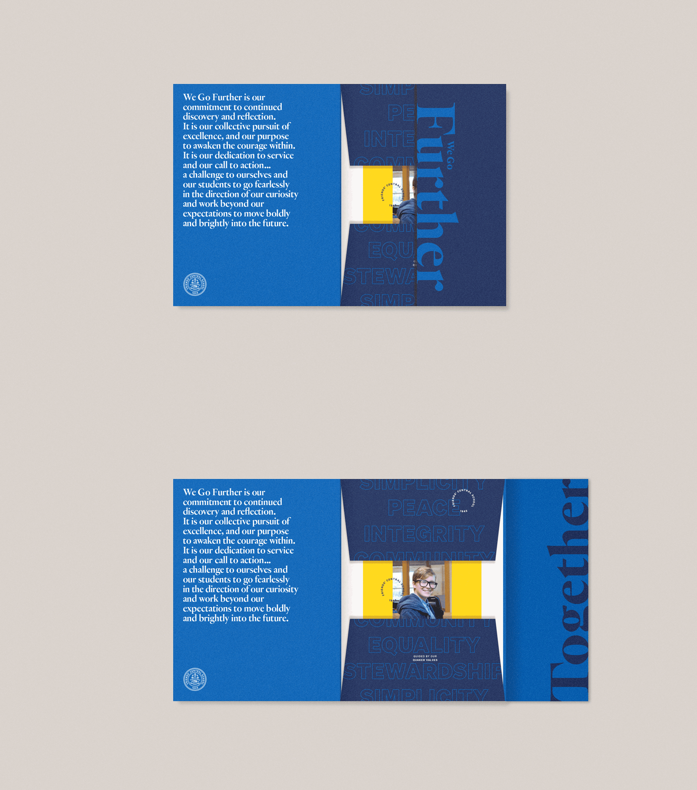
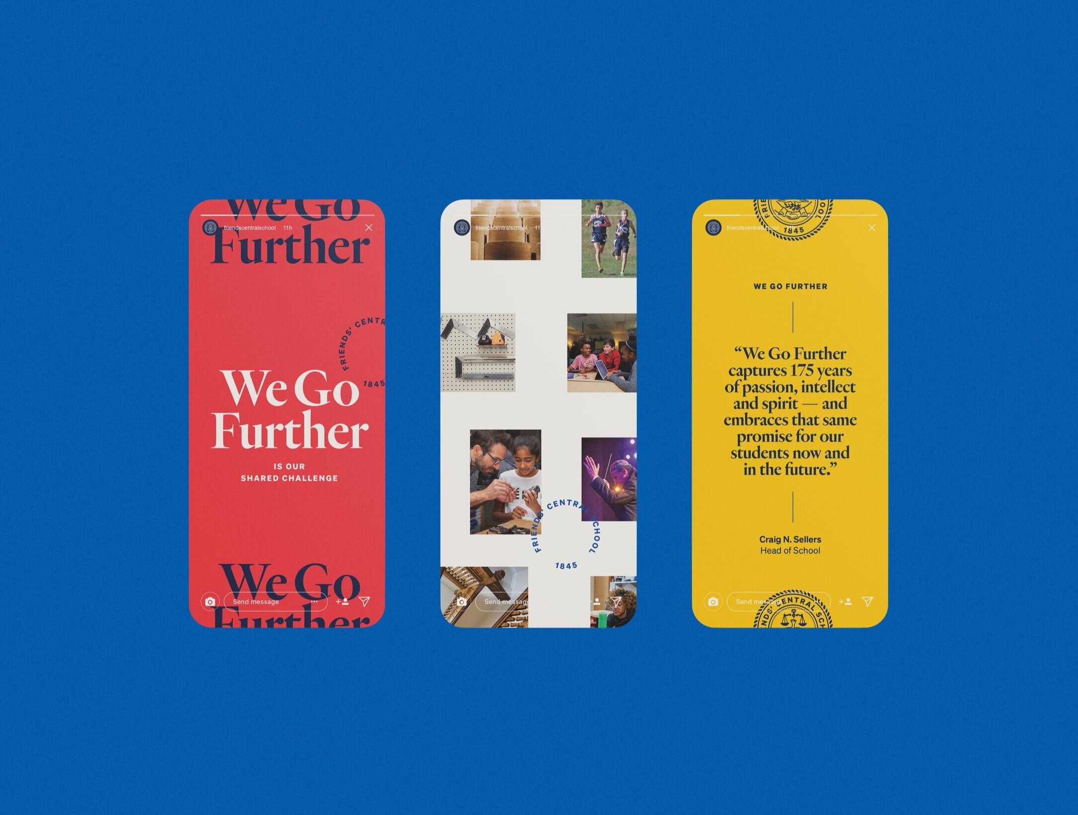
Typography and photography play a pivotal role in pushing the boundaries throughout the brand. Collateral tells a broader story of every student’s experience with the use of overlapping photography and graphics that expand along an underlying xy axis, creating dynamic and engaging layouts.
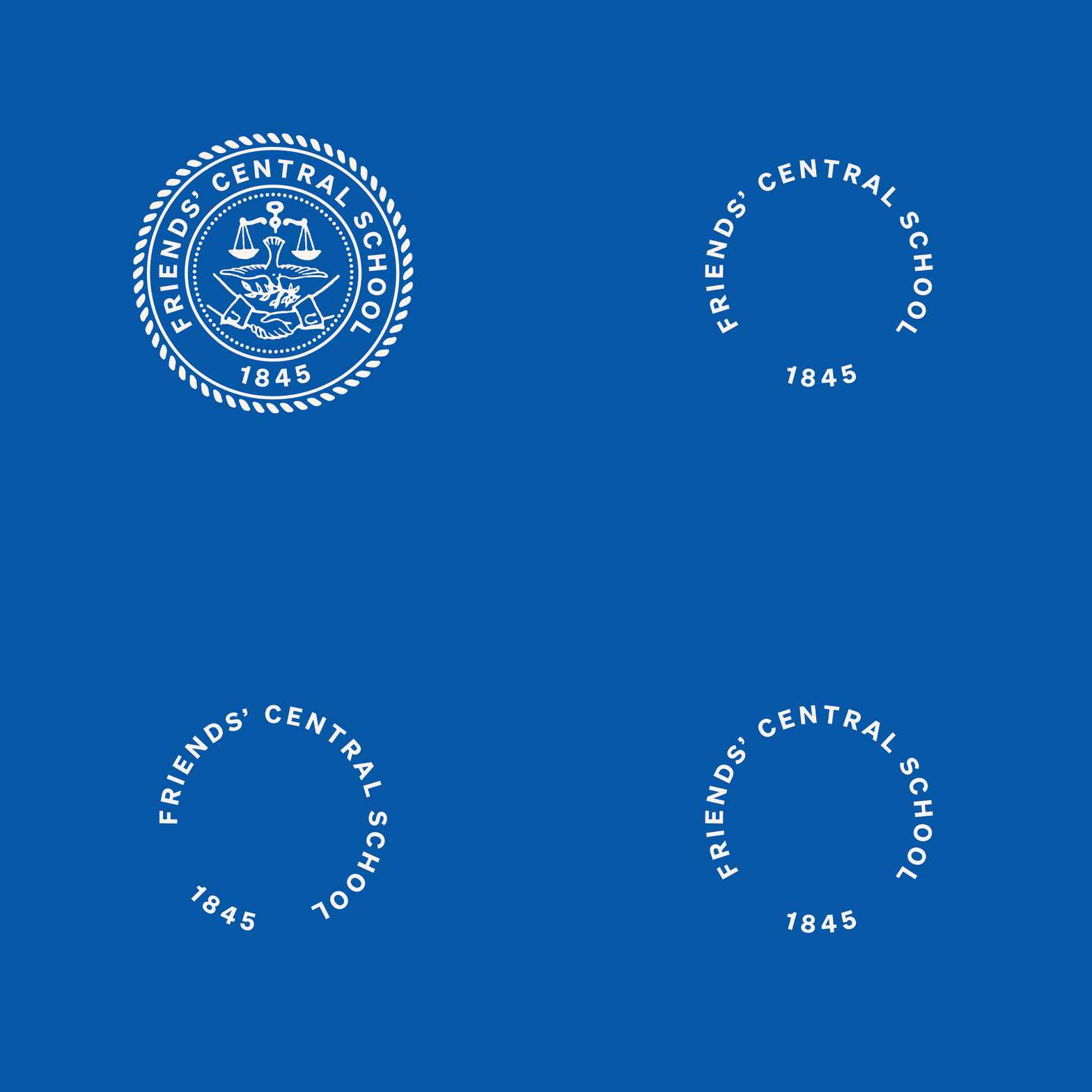
Their historic seal was updated to have cleaner lines and modern typography. The brand now utilizes multiple versions of the logo, and a new type mark, to layer into designs and add texture.
A bright and simple color palette paired with clean, modern fonts bring to life the stories of the students and faculty.
Type and image crop off the edge to express the school’s mantra of We Go Further.
Studio: J2 / Team: Brian Jacobson, Cara Cox, Lucy Price


