Graphic Design & Creative Direction
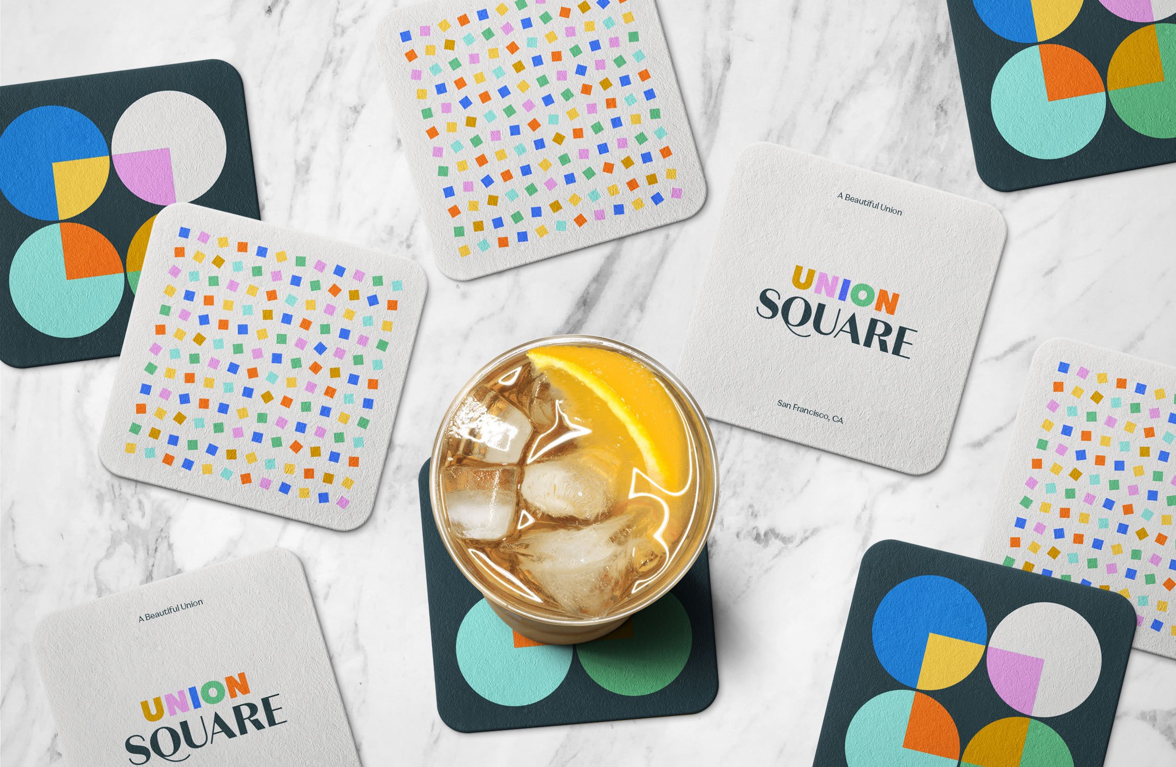
USq_Coasters.jpg

Union Square

Union Square

Creating a beautiful union

Union Square is the vibrant heart of San Francisco and an international destination where visitors come to enjoy exceptional retail experiences, luxury hotels, world-class cultural institutions, and great public spaces found only in the City by the Bay.

A new brand was designed to match the lively energy of the environment. The unique people, businesses and experiences were the inspiration behind the identity. A vibrant color palette, paired with classic and quirky font families, and patterns, set the stage for an adaptive brand that can continue to evolve as the Square emerges into its next chapter.


Black background with colorful Union Square logo on top
 
Bold color palette and geographic graphic elements used in the Union Square branding.
 
Overhead image of Union Square branded coasters scattered on a marble table with one cocktail
 
 
Font specimen using the words Elegance and Essentials repeated in black text over a vibrant purple background
 
 
Spil image of a union square annual report cover on the left and union square business cards on the right
 
Image of a blue union square branded van on a blue background
 
Graphic of circles and squares in a grid on a black background. Circles are filled with photos and bright colors from the Union Square color palette.
 
 
Union Square type specimen that reads: Ride a cable car with someone from Milwaukee, Milan and the Mission.
 
 
Photograph of a woman crossing a busy street, wearing a bright blue tote bag on her shoulder that has a large Union Square graphic and logo on it.
 
 
Graphic of 6 colorful stacked squares spelling UNION
 
 
A photo of colorful Union Square lamp banners and a photo of Union Square employees on a yellow background
 

Studio: J2 / Team: Brian Jacobson, Cara Cox, Jason Rothman, Lucy Price